Forecast of Distributions - TopDown
A usual ETF-Portfolio consists of both accumulating (reinvesting distributions) and distributing ETF-products.
Having a good idea of the expected distributions of a portfolio can be very helpful with the Cash-Management:
- Maintain a minimum cash reserve to be flexible
- Finance regular savings plans with distributions
In this post, we will forecast the distribution of several (> 100) ETF-products with a TopDown approach. Meaning, the forecast is based on the actual distribution time series. This is in contrast to a BottomUp approach, where a model would forecast the distributions for all ETF-Holdings individually and then simply calculate the sum.
Code: You can find the accompanying Juypter Notebook on my github repo
Data Inspection:
The available distribution data consists of the distribution amount and three date stamps: Ex Date, Record Date, Payment Date. Where the Ex Date marks the beginning of the process of distributing. Both the Record and Payment Date can be inferred from the Ex Date. For more details, have a look at the data analysis of the distributions.
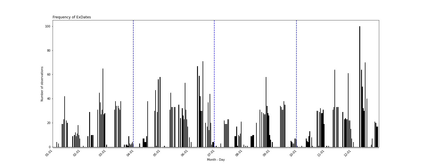
The distribution of the Ex Date does not follow a specific pattern. Though, they are nicely distributed within fiscal quarters (marked by the dotted blue lines) and there no accumulations around the end of quarters. This is a good basis for quarterly or yearly forecast models, as the distributions can be aggregated without problems.
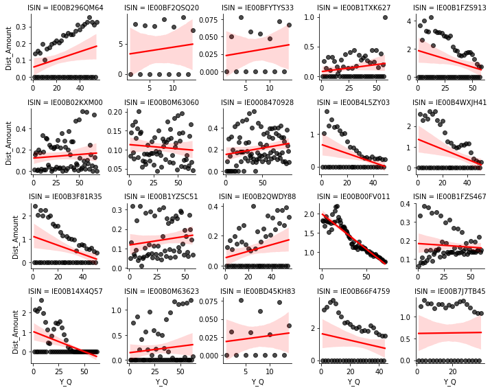
Quarterly data
In a first step, we will aggregate the daily Ex Dates to quareterly distribution data. The provided data has a lot of gaps. Quartes without distributions are either deliver with a “0” or not delivered at all.
For most ETF-products the resulting time series is very wild. There are many quarters without any distributions, the distributions vary a lot over quarters or they do not follow any trend. This is not a good basis for a forecasting model.
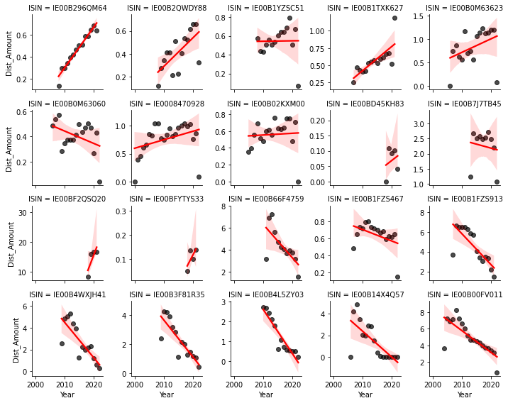
Yearly data
An aggregation to years draws a much better picture of the data. There is almost no dates wihtout any distributions. There are clear trends and no wild distribution patterns. The years 2021 and 2022 seem to be a cause for concern, as for some products, there is a signifcant trend-breaking drop in distributions. This is most likely caused by restrictions on dividend payments for certain industries due to Covid19.
In general, this is a very good basis for developing a forecast model. Breaking down yearly forecasts of distributions to quarterly or days can be done ex-post.
Time Series Properties
Before setting up a time series model, we need to inspect some properties of our data. These include checking if our time series is not completely random (stationarity) and how much a point in time is correlated with observations in the past.
Stationarity - Augmented-Dickey-Fuller Test
A stationary time series exhibits dependence of observations over time. It is not completely random and the time series property itself holds valuable information. The stanard test is the Augmented-Dickey-Fuller Test (Wikipedia), which holds the Null-Hypothesis of a unit root process. We apply the test to levels and differences as well with and without a trend.
For most distribution time series, the Null can be rejected in either of the four possible cases. Meaning, most time series exhibit properties which allow a good forecast. Upon visual inspection, those observations where the Null was not rejected, they have extreme outliers. As observed above, this is probably due to Covid19. Except for the outliers, these time series display clear trends and are well-behaved.
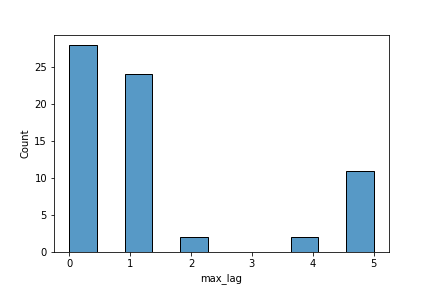
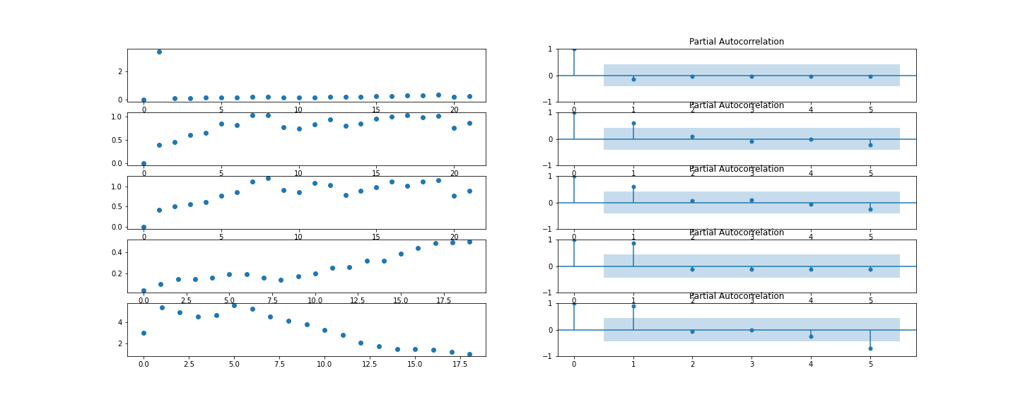
Partial Autocorrelation
Knowing that our time series are stationiary, next, we need to check on which and how many lags a time in point depends. The Partial Autocorrelation measures the correlation of a point in time with past points. (Wikipedia) In Example, the following Partial Autocorrelation functions display the autocorrelation of a time series with its own lagged values. There is always 100% correlation of value by itself (lag = 0). The blue shadow indicates the test-statistic. Any points outside the test-statistic are significantly correlated.
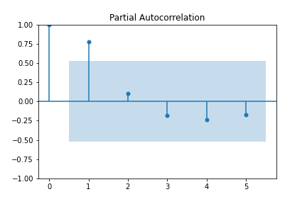
Over all time series, the maximum number of lags the levels are autocorrelated with, is either 0 or 1. And for a few 2 or even 5. The correlation with 5 lags seems random and unsubstantiated. In general though, these results are good news. We do not need to implement too many timelags. Also, a partial autocorrelation displaying correlation with too many time lags indicates random time series pattern.
Forecast Model
To develop a good forecast model, we first need to define a simple baseline model. Comparing the perfomrance of a new model to the baseline model allows us to quantify our progress. The aim is to keep the forecasting model as simple as possible. Therefore, any increase in complexicity must be compensated by a significant improve in performance.
Baseline
Judging from the Augment-Dicker-Fuller-Test and the Partial Autocorrelation Function, a simple lagged value model should serve as a good baseline model.
\[\begin{aligned} Y_t = Y_{t-1} + \epsilon_t \end{aligned}\]Random Forest
A Random Forest Regressor is a very versatile model. It can handle both level and differences as well as upward and downward trends. With linear models, we would need to create a lot of interactions or even different models to model complex patterns. That’s not feasible for a first model.
The dependend variable (Amount of Distributions) remains at the observed levels. For the explaining variables (aka features) we take up to 4 lagged levels, all possible absolute and relative differences between these lagged levels as well as average levels values. The optimal model is determined with a gridsearch.
For a visual inspection of the results, the following graphic provides some good and bad cases. Each colored line is a multi-year forecast of the distributions from that very point. E.g. the red line forecasts from the year 2016 to 2020. Comparing this to the actual data in black, the inefficiencies of the model become apparent.
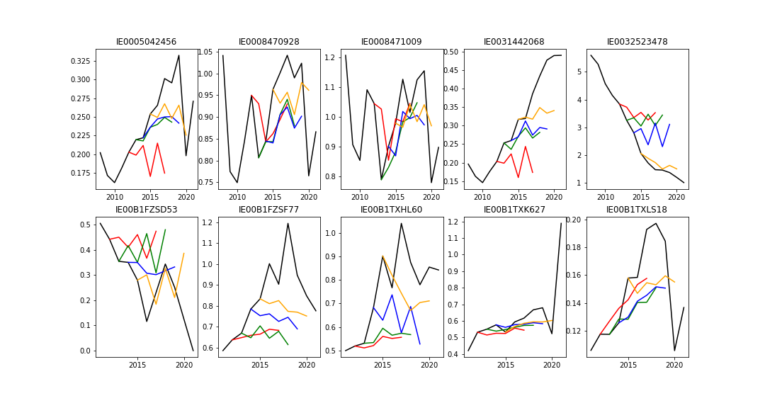
Observations: The model follows a very conservative forecast pattern. It is hesitant to both upward- and downward trends. It follows strongly the most recent observation and fluctuates around the average observed distributions of the last years. These are by not bad properties.
Out-of-sample Forecast
Now, if the backtest delivers okay results, the next point of interest is the performance of the model into future, unknown periods. With a visual inspection we can check, if the model continues the observed trends in out-of-sample periods.
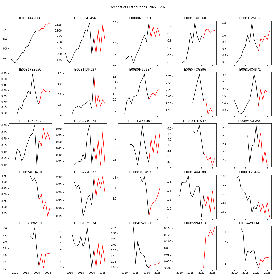
For a random sample of 25 ETF-products, you can find an out-of-sample forecast in the following graphic. The anchor point is 2021 and the forecast spans 4 years until 2026.
For most ETF-products, the forecasts look reasonable. Patterns observed in former periods are continued into the future. Sharp downfalls are followed with 1 or 2 periods delay. And trends are continued.
Outlook
The results are a very satisfying starting point. From here on, new models can be tested and compared to the baseline and Random Forest Regressors. Aside from XGBoost and Neural Nets, also more traditional appraoches like SARIMA and linear models (Lasso, Ridge, ElastNet) can be considered.
With more tested models, we need to determine an appropriate error metric to compare the models’ performance. Also, as we want to forecast several years into the future, the error metric should be calculated on several predicted data points. Ideally, we find a good model for a prediction of 4 to 5 years into the future. And can estimate confidence intervals.